
“User Experiences of Spanish-Speaking Latinos with the Frontier Behavioral Health Website”
by Raquel L. Dean | Xchanges 14.1, Spring 2019
Findings and Discussion
The major findings from this usability test were related to issues with learnability, memorability, efficiency, and error resistance.
For task one (locating services provided specifically for youth/children), five catastrophic errors occurred. The website’s lack of a visible menu button created a navigation barrier. Task one took the longest on average (85.66 seconds), with a 53.85% failure rate. Users were observed becoming frustrated early on. Participant six stated: “My instincts are to go to the menu, to find something like ‘types of services’… There’s a lot of text… which I’m not going to read. As a user, I’m trying to scan. But I can’t read any headers or keywords.” After a few minutes, the user exclaimed: “I don’t see a button that says ‘youth services’ or ‘children.’ I’m pretty much confused and… I give up.”
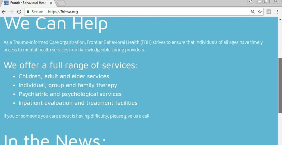
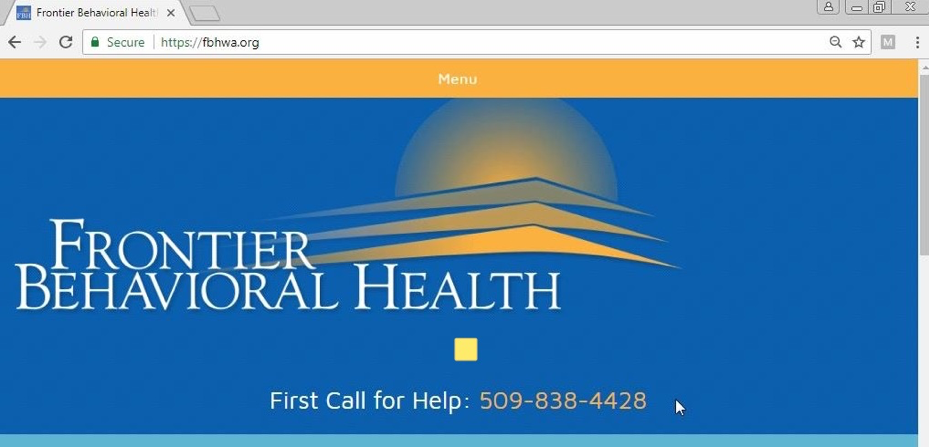
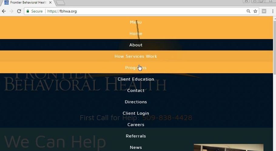
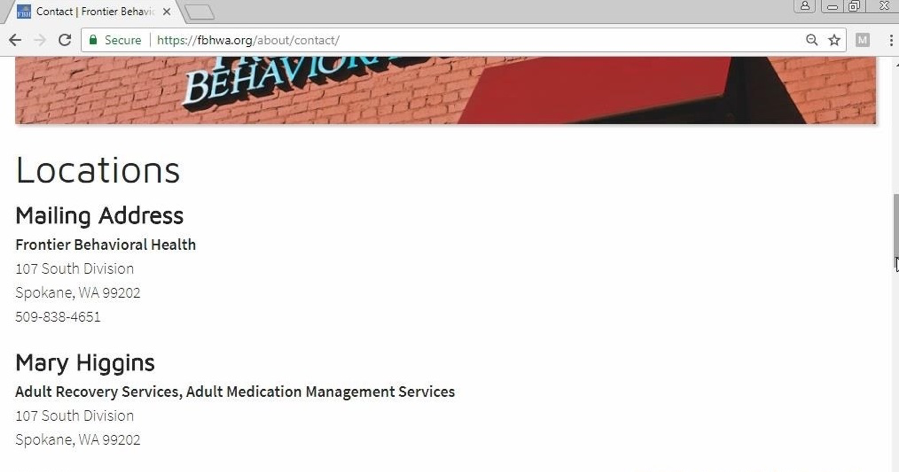
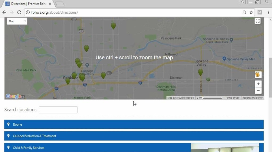
During task two (locate the nearest FBH facility), users continued to struggle. There were nine errors total (three cosmetic, three serious, three catastrophic). Users were confused between the “Contact” and “Directions” pages, both of which listed facilities. Participant 12 stated: “I just don’t know much of Spokane, so I don’t know which is close… okay, I’ll just say this one,” pointing to the first address.
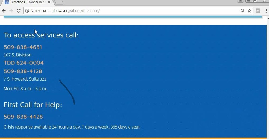
By task three (steps to begin accessing MHS), learnability, efficiency, and memorability significantly improved. On average, task three was completed in just 21.12 seconds — the fastest — with only a 15.38% failure rate and one error. Users had gained confidence and were beginning to utilize the drop-down menu effectively. Participant five discovered the menu button by this task, noting: “Look at that… the menu has directions! Clearly I wasn’t navigating this website fully.”
Task four (locating resources regarding mental health disorders) saw continued improvement in memorability, though with an average of 7.15 mouse clicks and 67.05 seconds per task, reflecting some difficulty in locating the “Client Education” link under the drop-down menu.
By task five (finding forms of payment), there were no errors. All users completed the task successfully, revealing no barriers in accessing information with ease and efficiency. In essence, the majority of user experience issues were tied to the lack of visibility of the menu button and the absence of a search bar.