
“Cybersecurity Computer-Based Training and Technical Communication Design”
by Lysandwr McNary | Xchanges 9.2
Results (cont.): TC Design
The module has significant deficiencies in accessibility, audience awareness, user-centered design and navigation, and text and visual rhetoric.
The initial screens introducing the heads up display and leading into the multi-media presentation are consistent in font type, color use, and groupings. Later screens deviate from this format and occasionally appear as if they were inserted after the training module was completed. This detracts from the module’s overall credibility.
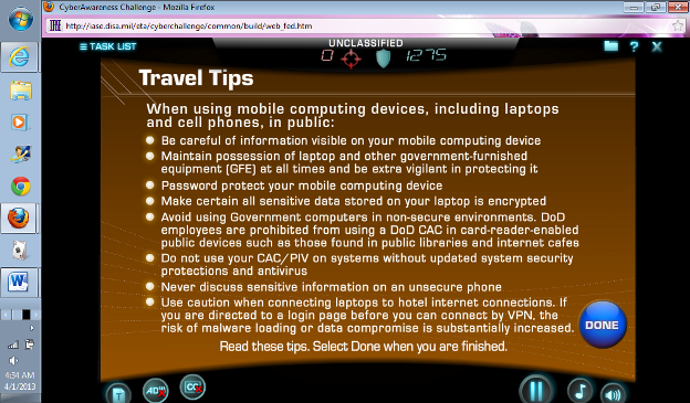
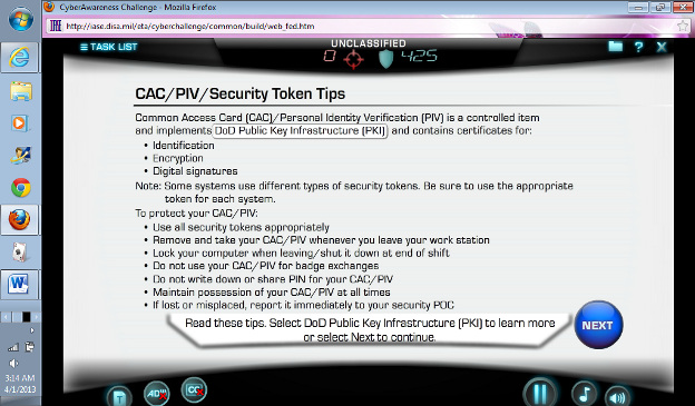
The primary font used on both the heads-up display and most of the screen text was obviously selected to appear modern and similar to a computer-generated text; however, it does not appear to have been selected for ease of reading or learner comfort, showing a lack of user-centered design and audience awareness. The text curves become problematic on screens with a lot of text blocked together.
The audio description button provided in support of 508 ADA compliance gives only brief audio descriptions of the visual appearing onscreen. If a learner requires the audio description they are unlikely to be able to finish this module — the audio description fails to describe the exercise selections presented in text on the screen, so a visually-impaired learner would not be able to complete the exercise.
The grouping of the task screen is visually confusing in that the headers are over more than one section at a time. In addition, the only way to review a section is to use the open task list button and return to what is essentially the menu for just the tasks in the module or to restart the module completely. There are virtual environment clips and some exercise questions/information screens which cannot be rewound or replayed without restarting the module or repeating the segment prior to the screen the learner wishes to review.
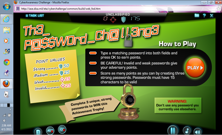
Each segment within a section has a game or challenge element. However, the number of colors and fonts used in these elements do not appear to be considered in light of target audience demographics (which range up to retirement age, for example). The Password game element has six fonts in seven colors, including a difficult to read “leet” font. In addition, the color choices do not appear to have been tested for red/green color-blindness issues.
With eleven highly varied game elements in the module, the potential for stimulation overload is extremely high — this increases the likelihood of learners clicking through the module. The distracting visual rhetoric, combined with music and a variety of tasks to track, may not be effective or even appropriate for all members of the target audience.