
“Contextualizing Place as Type: Creating an Auburn Typeface”
by Harry Lewis | Xchanges 12.2/13.1
Design Parameters
This Auburn typeface is designed to be used as a Small Caps typeface, in that all the letters are capitalized, with the initial letter being larger than the others for added emphasis. In the case of this particular typeface, the small caps are slightly different than the initial caps: the smaller caps do not have the accent line through the stem.
The decision to use the accent line only for the initial caps and not throughout the typeface was done for two purposes:
- To be a visual representation of the spirit of the campus community (accent line) located within the physical space of the University (stem), without overusing the design choice.
- To reduce the chance of vibration when scaling down the letters. Vibration occurs when design elements are in close enough proximity that they begin to blend together or lose clarity when printed or displayed on a screen. The small caps are 3/4 the size of the initial caps (Fig. 8).
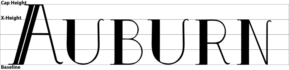
Theoretically, this typeface would be used on campus signage, marketing documents, or as the title on official Auburn University communications and stationary. As the typeface is not intended for usage in body text, a pairing of a serif typeface is required. Serif typefaces were determined to continue the design language shown in the display typeface, and the available options shown below were chosen for their refined, professional personas.
Available options include:
- Times New Roman
- Garamond
- Bell MT
- Goudy Old Style
Strictly unavailable options include:
- Georgia
The unavailable option was selected in honor of Auburn’s fierce rivalry with the University of Georgia. As this exercise was a practice in locating the influence of an environment upon a rhetor’s composition process, outlawing the Georgia typeface seemed appropriate.
Classroom Implementation
I see this exercise as one that could be used as a month-long project for an undergraduate introductory composition class. As first-year students enter their college careers, they may be seeking ways to become acclimated and comfortable in their new surroundings. I see the spatial typography exercise as one that allows the designer to recognize, theorize, and then materialize the spatial metaphors on their college campus that may influence their composition process, while becoming more acquainted with their surroundings.
To do this activity, I recommend introducing students to The Nature of Rhetorical Criticism, by Sonja Foss (2009), as a way to first understand rhetoric as a concept that isn’t exclusively contained within the margins on a piece of paper. Foss (2009) states that “although rhetoric often involves the deliberate and conscious choice of symbols to communicate with others, actions not deliberately constructed by rhetors also can be interpreted symbolically” (p. 5).
Along with Foss, I recommend the first chapter (“Introduction”) from Tim Cresswell’s (1996) In Place – Out of Place: Geography, Ideology, and Transgression. Cresswell’s piece presents a casual entrance into spatial recognition through stories and examples of how we recognize and define places.
Accompanying the Foss and Cresswell pieces, I recommend three particular Ted Talks: My Life in Typefaces, by Matthew Carter; Wake up and Smell the Fonts, by Sarah Hyndman; and Typography – now you see it, by Shelley Gruendler. These performances are good examples of how we can view typefaces as artifacts that convey different personas and avoid overwhelming undergraduate students with graduate-level literature, such as by Brumberger and/or Mackiewicz.
Following an introduction to appropriate literature on typography and rhetorical analysis, students would be assigned the opportunity to design their places of composition. Students would then be assigned a criterion for how many letters to design – their school’s name is a good example, as it keeps in line with writing the university. Following their letter design, whether by hand or computer (Adobe Illustrator works well), students would present their typeface and demonstrate how they rationalize design choices.