
“Contextualizing Place as Type: Creating an Auburn Typeface”
by Harry Lewis | Xchanges 12.2/13.1
Design Inspiration & Methodology
Auburn is defined by more than what it is now; the school is inextricably linked to the Civil War, to athletic achievement, and to the legacies of prominent figures who have come and gone. As a university is ever-changing to accommodate the needs of the current student body, as well as to attract those who will represent the next, the tradition of the space acts upon the students travelling through the institution, just as the students act upon it (Drew, 2001). This transient student body, inviting new ideologies to the Auburn Family, is a clear representation of Lefebvre’s conceptualization of place as somewhere that’s constantly changing and therefore cannot be cemented.
From atop the Eagle’s Nest, the organic, human beauty of the campus is diminished, and emphasis is placed on four construction projects surrounding the Haley Center (Fig. 1). One is an addition to the library, to benefit the College of Education; another is a new Engineering building, directly across from a face-lifting project for the chemistry building; at the edge of campus, a large white crane looms over a half-developed future apartment complex. This perspective of Auburn delivers a promise of progress and growth.
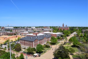
Understanding a space and observing Auburn means to recognize the ways in which different factors of spatiality inhabit the same place. To observe Auburn means to understand how the material space exists and interacts with those who inhabit it; the representational nature of space and how it’s perceived; and, the experienced and lived nature of the space as done by those who have come and gone, per Lefebvre.
As inspiration for typographic design, I must blend representations of both the materiality and spirit of Auburn. Much as de Certeau observed Manhattan from two perspectives to produce different representations of the city that were still one, my typeface must graft both perspectives of campus into one attractive and representative artifact.
Designing the Typeface
Typography offers a designer the unique opportunity to form a narrative through letter design, however, a simulacrum of a university with such a storied past, and so many cherished traditions is no small feat.
Things to consider during my design process included the materiality of the campus, which includes the columns and arches; the design language of current, past, and future buildings; as well as staple spots. The emphasized places are the locations you just have to get a picture of while you’re here – such as the University sign in front of Samford Hall, Toomer’s Drug Store at the junction of campus and downtown Auburn, and Jordan-Hare Stadium, the epicenter for Auburn athletic achievement. “Auburn the institution” and “Auburn the town,” while separate entities in theory, coexist essentially as one, with the academic and non-academic communities blending together as one.
Equally important to consider, if not moreso, is the organic side of Auburn: the people, the history, the toilet paper. My task was to create a typeface that was both strong, intelligent, and professional, yet approachable and inviting. It had to be strong, fit to stand the test of time while remaining an icon of excellence; it also had to flow, be visually appealing, and not look out-of-place if ever placed within the campus setting. As with Eva Brumberger’s (2003) lesson on persona inherent in typographic design, I strived to create something that was strong like the brick and mortar materiality of Auburn, while also meshing it together with a flowing, organic representation of the spirit of the student body and the University’s traditions.