
“Analysis of Web Content Delivered to a Mobile Computing Environment”
by Anthony Perreault | Xchanges 6.1
Walmart.com
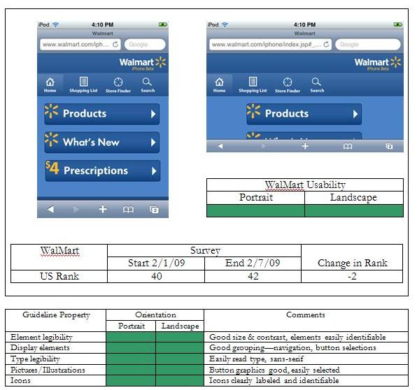
Walmart, America’s largest retailer, has an excellent mobile presence. The site is a model of simplicity with its color scheme—four shades of blue, white, and yellow. The user is presented with seven selections, three that are large buttons that take up roughly 2/3rds of the screen space, and four icons that are clearly labeled “Home,” “Shopping List,” “Store Locator,” and “Search.” The three buttons—”Products,” “What’s New,” and “$4 Prescriptions”—take the user into the site based upon pre-determined categories.
In landscape orientation the site is slightly less usable, the user having to scroll in the vertical axis in order to view the ‘What’s New’ and ‘$4 Prescription’ buttons. For people on the go, the option of finding a store through the ‘Store Locator’ icon is of great use, especially if you’re traveling in a new city and need to do some last minute shopping.