
“Analysis of Web Content Delivered to a Mobile Computing Environment”
by Anthony Perreault | Xchanges 6.1
Flickr.com
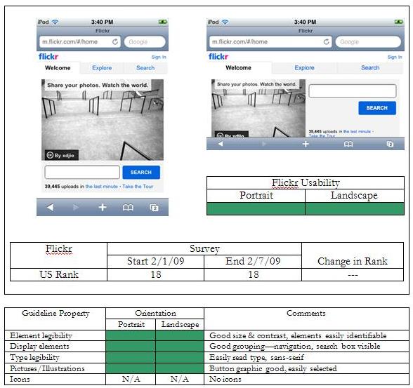
Flickr is an online image hosting site that optimizes its content for the mobile environment. As can be seen in the screen capture, roughly 50% of the available space is taken up by a randomly selected image. The remaining space is used for navigation—”Welcome,” “Explore,” and “Search”—along with a search field at the bottom of the image. In the upper right hand side there is the link “Sign In” that will bring up a username and password page. The background is clean with no clutter, I can easily differentiate the navigation choices and enter text in the search field and press the blue “Search” button.
In landscape orientation the site is still exceedingly usable. The image still takes up about 50% of the display. The search field and button, placed below the image in portrait orientation, now occupy the right-hand side of the screen. The navigation has expanded to fill the available space, becoming larger and easier to select for larger fingers. The majority of content is visible, requiring very little scrolling in the vertical axis to see the rest of the page.